Swish has a huge group of audience, and we did believe that everyone should have the same opportunity to enjoy Swish app and benefit from it. I worked as an UX designer to improve accessibility for their app experience and make Swish more inclusive to those who are visually impaired. Building a new voice over specification that can ease the load for target group to use the app.
Year
2016
Project Type
Service Design
My role
- Plan and conduct UX audit
- Plan and conduct usability test on target group
- Analyze results from audition and user test
- Create voice over specifications for all views in app
What is Voice Over?
It refers to the use of screen reading software to read the content of a website or other digital product out loud for users who are blind or have low vision. This can help people with visual impairments access the content of a website or application and use it more easily.
Process

UX Audit
I planned and conducted an UX audit for 5 main features of Swish, including most scenarios that a user will encounter. All the findings are documented with different error types.


User flow chart
Map out Swish app and see all the related views and actions when customer interact with app.
Documentation
A sheet that documented all the details from the audition, videos record were taken if necessary.

User Test
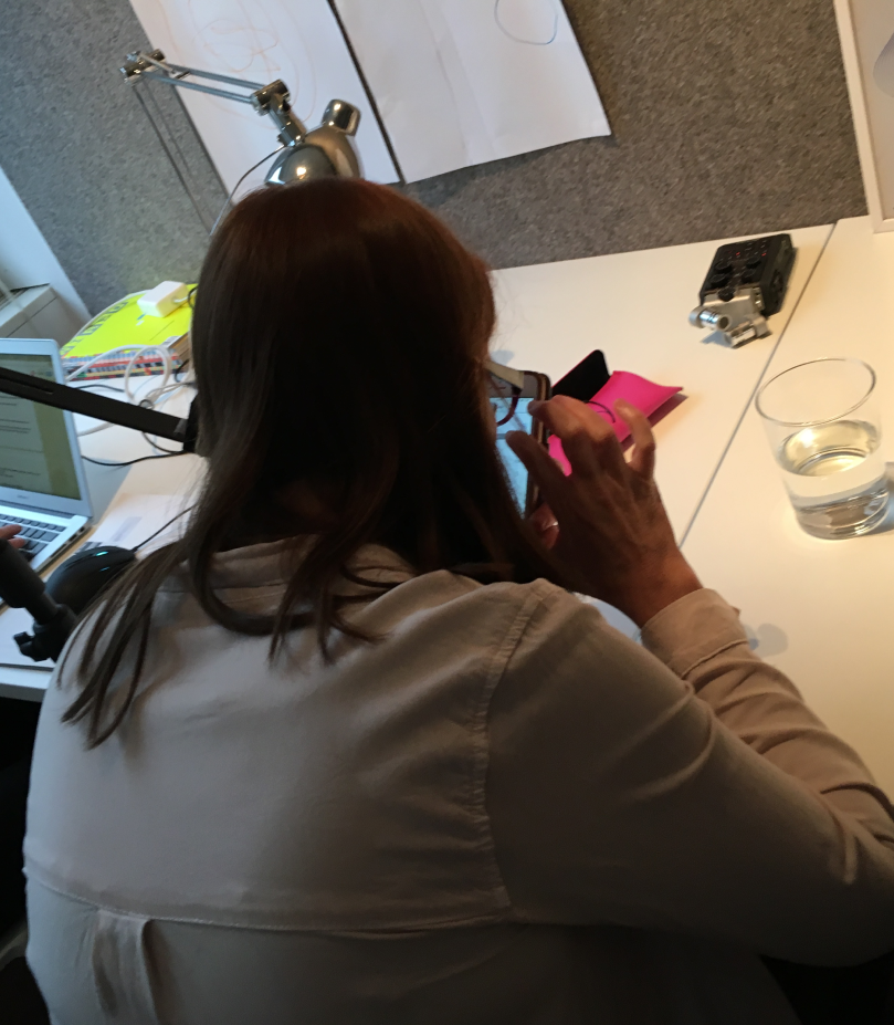
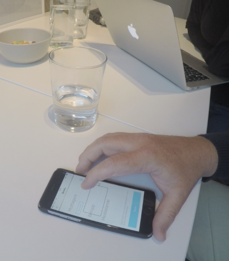
We did user test on 5 different users with visual impairment. All of them has a regular usage for Swish (once a week). Participant was asked to conduct tasks related to 5 features and asked their thoughts about how voice over help them when using Swish.
Findings from user test

”
I want to know where I am, but the first thing I heard (when landing on a page) is close window button.
”
It’s so time consuming and uncomfortable to double tap for texting.


1
2
3
There exists many basic wrong labels and users were confused and thus reluctant to move further
Some features provide efficiency and shortcut, while users were not aware of it because it was missed in voice over
Help is not really helpful and users were confused to understand what has went wrong and how to fix
Specify what is accessible Voice Over for Swish

With analyzed results from audition and user test, I revisit 22 views again and identify how Voice Over could be more accessible for target audience. Each view are specified from 2 perspective: element and structure.

Element
Element represents each single components that are presented on the view, could be a text, button, icons, etc. For each element, voice over would explain:
- Shortly what is the name. (eg. ‘Betala’)
- What type of element (eg. ‘Button’)
- Some hints regarding how to interact with it (eg. ‘Double tap to confirm payment and visit BankID app to verify.’)
Structure
Describe an overall view, where we should start to guide users from a long list of elements. We should make sure that:
- User understand what is this page
- There is no element missed by Voice Over
- Elements are presented in a sequence that is intuitive for user to navigate

Deliver
Voice over specification were further polished by copywriter, to make sure that all the copy are intuitive and easy to understand. Then they were handed over to development team to implement.
My learning
My biggest outtake from this project was – Never assume that user will behave exactly like what you expect.
UX designers are users as well. When working with a service/product that they are familiar with, designers are likely create assumption that user might act exact like what they do. But in this project, when testing with users with visual impaired, they have broken some of my hypothesis regarding how they move around in the app. They provided extremely important data about what is actually needed rather than ‘I think they need it’.
